Pages

Monday, February 29, 2016

Go Nebraska!

 What is this! Anyone that knows me knows I'm not a Nebraska fan, but this particular time I was. Let me set the scene. LOAD Day 24: Culture and the prompt was Sports, oh my which way to go yes which way to go. Lets go back in time a bit and do a layout from the past. I had these pictures printed so long ago and haven't done anything with them, well this day I did, I got the pictures on a scrapbook layout. (I've got lots of photos for Calvinball next month, when I found these I found a whole box full)
These are our son Albert's kids :) See Mom (Andrea) went to Nebraska by way of online for college and she got her bachelors degree there. Well when the Nebraska's Little League team came here to play for the Little League World series, she made sure to root them on, which in turn I rooted on, too :) This was the day they went up to see the 1st game that Nebraska played. She posted these pictures on facebook, I grabbed them with the intention of doing a layout. Oh my the kids were so little just a few years ago .
I used the sketch over at The Memory Nest for my layout No. 54

I did like the way the arrows were pointing at things and I used that to point out alot of the journalaing blocks
  Top photo, left to right: Avery, Elias, Isabelle and AJ (Albert Jr.)
 Alot of the Ephemera came from Echo Park's Jack & Jill collection. This picture is the kids standing in front of the Carl Stotz memorial statue at Volunteer Stadium. (Layout about this memorial will be coming in a future layout) Enamel hearts and dots, word strips and ribbon for the tag came from my current kit as did the Jack & Jill collection.
 On the monument
Journaling and a fun title block. Some pieces here come from the October Afternoon Midway collection.

Authentic

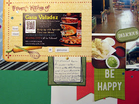
Were getting down to the end of LOAD216 just one more day left, today :) But this one is from yesterday's load, Day 28: Food. I have been wanting to do this layout a few times this month but I had to find the picture I took with the hubby's camera that day. So finally took the time last night and located the picture :) the other ones I got off the internet, but the one inside the restaurant is the one I took. While I was looking I come across a few more pictures that I need to scrap too, oh boy!
When we went to Altoona, PA to see the RR Museum and Horseshoe Curve, we decided to grab supper before getting on the road to head home. We stop when we saw the sign for this place, we both enjoy Mexican food. OMgosh! were we pleasantly surprised about this place, it is an Authentic Mexican restaurant :) Yes and their chips and salsa homemade you can tell swoon!
I got my background colors from outside of their building. Also the stars representing the rating of this establishment and the hearts cause we loved it so much! I saved their business card for use on the layout, I thought the recipe card appropriate here for a mat. The 2 word strips come from 2 signs they have hung up on their walls. Our Casa is Your Casa you see when you walk in and The best place to be is together sign is on the wall among all the stuff they have on the walls (like crackle barrel has)
I used the sketch over at Sketches in Thyme it was this past week's sketch

I really enjoyed using this sketch :)
The business card, word strips and my journaling
 The photo block. The have these very festive backs on their chairs I had to take a picture of them, the man in the picture was our waiter, very nice person and the place was cool to see and very friendly to be in. The picture of those chips and they serve it with 3 different sauces we just loved the red salsa would love that recipe to make it here at the house.
 Close up of the bottom corner block
 Close up of the title block
I tried a photo on an angle so you can see the glitter effect of the letters and I scattered dots that was on the Alpha sheet around the layout too. I used my current counterfeit kit: Color Splash for my layout and the pennants come from last month's kit.

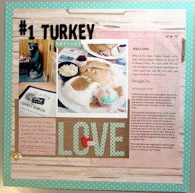
#1 Turkey Special

LOAD Day 21: Food. So anything about food. This time I went to a new spot of challenges for inspiration :) for my layout. Some how I decided on this Turkey Dinner that Dave and I got Oct. 10, 2015, after a Tractor show we went to for my layout. Then I went over to Whimsical Musings looking for prompt to work from, they have an entire list of fun prompts to get you started here
From that list I found prompt #48 Inspired by Ice Cream and that is what inspired the color scheme of my layout was that bowl of Sherbet on my plate.
Fry's Turkey Ranch is a restaurant that is off route 15, the tractor show we went to on the way home we decided to eat locally, but the one restaurant in the town was so busy and we were so hungry we didn't wait around very long. So traveling back home we came across this billboard of this restaurant, and we both chatted a bit about checking it out. So there you have it in a nutshell :) The reasoning behind us being there :) Surprised that we never had been there before, they have really good food. So this meal is what they are famous for and we had to get it! Wow a plate full indeed and we had a salad with it that came first.
I used the sketch over at Scrapbook Challenges for my layout, sketch #469
469
With the extra journaling about the history of the restaurant I shifted my photos over a bit more, the elements of the sketch is still there :)
 Journaling about the restaurant and how it came to be
 That delicious meal :) Got to be the first time we went out to eat and Dave was too full to get dessert and were the slice of pies piled up. The bear greeted us when we walked in :) a quick shot of the front of the menu and a big photo of the dinner. Yum! All Instagram photos :)
My journaling. I used my current counterfeit kit for the alpha for the title, the word strip on the large word strip block and the gold hearts scattered about the layout. The background paper came from last month's kit.
If you like to go with a prompt for a layout you'll have to take a look over at Whimsical Musings blog and they have a facebook group too. I will be using there prompts in March for Calvinball to help spur some stories to tell and to help create so fun layouts

Home

LOAD Day 20 is a Geography prompt. I went with the inspiration of the designer layout today for an idea for my layout. So her theme was city life vs where she lives and I could relate to that. That we live on the outskirts of it just a mile away and you wouldn't know it with 1 1/4 acres of ground that my husband gardens away from the hustle and bustle of the city.
 Home is the best place to be :) Everyday moments make the best memories, What I love most about my home is who I share it with. I think that sums up very well why Home is the best place to be. We do enjoy the quiet that we get living away from the city, which is most of the time other than soccer season and when Little League takes place then the whole borough can usually hear that :)
I used the sketch over a Scrap Our Stash:

From the list: 1) Doily 2) Ephemera (lots of this) 3) Fawn color , I picked up most of that in the journaling block and also throughout the layout. I really enjoyed this sketch. 
 Close up the block of photos of the yard and part of the garden
 My journaling block. Most of the papers came from last month's counterfeit kit Brighter Year Ahead and a older kit that had all the fall theme pieces in it. I also used the other half of the doily I had just used on a previous layout about the local Library, so glad to use up that scrap :)
The bottom corner element has a picture of the city of South Williamsport, we are a small borough but across the river is the city of Williamsport and that is the city life I really was thinking of :) I do love the city I grew up in, but now I love my home life and surroundings much better :)

All Together Fun Day

This was an "All Together Fun Day". it's a happy kind of day! LOAD Day 17 is Culture and the prompt was Museums. Through the list I created this day came to mind and I ran with it. We are lucky to have this gem here in our area so we can go and visit it whenever we like.
The Sones Farm & Home Museum is just that it depicts the farms and homes of yesterday, here mainly of Lycoming county, great to see so much local history here in one place and it's jammed full of good finds and great memories.
I used the sketch over at Sketches In Thyme for my layout, it's the week 3 sketch

I love that it had all those photo spots and with it I created a few more photos spots but it is the essence of my layout.
 The left side of the layout has many pictures of the outside of the Museum and the framed article about Oliver Sones and  that the county's first mill may have be discovered. He was there to greet lots of people that day. We were there on a mission to see if he would bring his Minneapolis Antique Tractor to Penns Cave. Out that conversation we got free admission to the museum :)
 Up close on my Title block and Journaling block
 The right side of the page just holds a few of the photos I took that day of the Museum that spark some interest and fun :) One of the early dishwashers really caught my eye WOW we did come a long way from that.
A close up of a good time by the expression on my husband's face. I found this fun sign sticker in my vacation stash and used that for the date block
It was a joy to be there and if you ever come to Williamsport, PA its a spot you want to put on your visiting list. I used my current counterfeit kit for this 2 page layout.


19 Hours

It took me 19 hours to get to Des Moines, Iowa from Williamsport, PA. Yep Map Quest lied to me :) it said it would take approximately 15 hours, thinking oh I can do this and probably get there a little faster if I drive a bit faster than the speed limit! Not!
This is LOAD day 16 Transportation: Car as soon as I heard that it was car this was the 1st thing that popped into my head, a story I tell very often so that should be the one I scrap.
I have pictures of the hotel and the view from my hotel. I had kept the map and cut that apart to add to the layout like it was scrap paper. Cut outs from the brochure I received for membership, lots of travel related embellishments and some journaling too. Pictures of the ride home too some of the huge farms along the highway, a very flat highway. I made sure to make it a 2 day process going home with staying over in Indiana. This layout is packed full!
I used the sketch over at Let's Scrap for my layout inspiration

The essence of the layout is there, I used alot of the clustering blocks with the map and journaling spots.
 The left side of the layout has the Map, a view outside the window of my room, When I walked out of the hotel to the city view and that awesome waterfall. Lots of vactaion style stickers and cutouts. Veneer arrow pointing to the destination and 19 Hours is in foam style thickers. The No. 01 refers to this is my first NNEP Embroidery Event, a  convention and business trade show.
The right side holds a picture of some of the banners of the companies that are there. The front of the Road Map has the date, The journaling block there talks of my drive. Some fun traveling embellishments, another small cut out of the map with that interesting word sticker and a couple pictures of the farms I saw on the way home off the highway. (Lots of flat land, something I'm not use to :)
 The views
 The title section
The journaling
 A small map of the state and an interesting sticker
 The picture of the farms I saw (so flat :) the hubby would love to farm that soil) The wood veneer journey actually points to the car punch-out
A closer view of the trade show. It was an experience for sure. They crammed alot into 2 days with the last day we could venture the sales area. I planned to get a hotel half way home so wasn't in to much of a hurry to leave. I used my current counterfeit kit Color Splash and my travel theme stash.

Sunday, February 28, 2016

Mom's Ham "Popeye" It's a Pennsylvania Dutch thing

Yes you read that right Ham "Popeye" :) This is LOAD day 14: Food. I decided early in the day what I was going to do, I think the inspiration was from the layout that was done for the LOAD video that the girl's favorite dish was not a favorite of her family so when she visited her Mom they always had it then so she can enjoy it. Well that made me think of one of my favorites from growing up, but my family loves to have it, it's a treat for us.
This layout is very heavily journaled I wanted to tell the back ground of the Ham Popeye we all love. Well of course with all that journaling going around in my head we had to have popeye that night for supper. So pictures of all the steps were taken and makes up the collage photo. I found a favorite photo of my Mom and lots of fun foody embellishments to tie it all together.
 Collage of the process of making photos
 My mom :) Besides being my mom she was a great friend too. We had her over the day she taught me how to make popeye, (it's all in the way it feels she said, you don't want it to wet or to dry she said in reference to the dough) at that time I wasn't scrapping didn't know anything about it so never thought to take pictures. But I have the memories and can draw from there for this layout
The journaling.of the history of the name, the recipe history and my fond memories of this dish of comfort food. I used my current counterfeit kit Color Splash and some food related embellishments from my food scrappy stash.

The recipe is pretty basic and easy. Ham, broth with water boiling in the pot. 4 cups of bisquick mixed with 2/3 cup of milk. Roll thin and cut out the squares of dough add one at a time stirring quite often to the pot of boiling meat and simmer with lid for 20 minutes checking every so often that it has enough liquid :) That's it The rolling for me takes the longest. When we have roasted ham we plan for a couple of these meals and freeze the ham and broth together :)

James V Brown Library @ Christmas Time

LOAD Day 12: Landmarks. Lets see what can I do this week :) I made a list and then I decided on the James V Brown Library. I had taken some pictures of the library at Christmas time for my December Daily and I knew I had a few extra photos I could use to tie in the landmark story with something current too :) Research the library abit to have the history part of it for this layout and I found a then picture to go with the now picture I had.
It hasn't changed much over the years. I found this great sketch to use over at Scrap Much?

 This is the February 5 sketch
The left side housed the information about how the library became to be and still today stays true to it's original mission. Picture of the bronze nutcracker
The right side holds the 2 other Christmas pictures, one of a statue and one of the tree in the rotunda.
Close up of the title work with holly brads, I used a square doily on the layout. Most of the layout came from my current counterfeit kit Color Splash
 Close up of the photos
Close up of the title work
My personal journaling :) This is one of my favorite LOAD prompts right now, the Landmarks. I have learned so much about my city in just a few of them that this is going to be an ongoing project. I found a guided walking tour and would like to take it in the spring for my own photos of the historical places here in Williamsport, PA and a theme album just on the something that could be looked back on by generations.