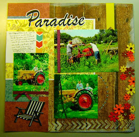
here is the inspiration layout that I lifted/forged

This was a fun layout to put together, took a bit of time because of all the techniques that I did to it:
What I figured out when I went to first start the layout I noticed on the inspirational layout was the white edges and arrows so I got out CTMH colonial white ink and the arrow stamp from Reel Life Everyday Life stamp set. I added the stamp arrows around the page like they did, also I did the edging too around the page. Added the flowers to the one edge, that's 2 techniques that I don't normally do but was fun on this page.
This side included a punched border and I like how it separated out the pictures gives it nice balance on the page.
Some close up shots:
Rhinestones in the form of a circle along the picture ( I used a masking tape edge for the circle) It was irontic that Dave was wearing the same shirt as Jessica had on, made us feel so good to see one of them wear the shirts we gave them the last time they were here 2 years ago.
My husband and Melissa's father looking at our MM tumble bug plow (part of our paradise is the tractors we collect)
The other part of our paradise is our family :) a nice family shot that I got from Melissa. The die cuts are from the Silhouette store and cut with my cameo.
I added 2 pictures to the large spot they had on the inspiration photo and they are my favorites of the day. It was a nice shot of the girls on the tractors in the one shed and a photo opportunity I didn't want to miss.
As the way it is nowadays when the adults are visiting you look over at the kids and their eyes are on their phones. Jonathon our grandson and the girl's friend Mercedes.
The lower photo is Melissa, our DIL and Mom to the kids, the top photo is Jes and Amber (sisters :)
I added a Journaling card (Snap card) from my current kit, (something seemed missing in this area and the journaling worked) part of the card was on the other side (I pulled it off not wanted on that page) but my journaling I wanted to avoid where the page split was and some how it went in a slant :) hmmm so what do I do with that, still debating on it. Since it's a picture of our grandson with Pap I didn't want to add a flower so maybe just let it be.
Thanks for stopping by today and seeing the view for my little corner of the world :)


Such a rich double page spread - you have outdone yourself!
ReplyDeleteA bright happy page. Love the rhinestones!
ReplyDeleteAwesome job Tina! Beautiful take on the challenge, love your paper selections.
ReplyDeleteCindy F
What a great layout! I love the layout you chose to lift and I think you did a great job with that! The pictures are wonderful! I love this family themed two page layout! TFS!
ReplyDeleteThis turned out so awesome Tina!! I love how you did the chevron arrows and continued it over to the second page. The chairs die cuts look just like your chairs. I love the pictures on this layout too, they are the reason we scrap! They are awesome! I wouldn't worry about your downhill journaling, I think you should just leave it because it shows "real life" and that we don't always write straight. lol I know I don't! Hugs, Brenda
ReplyDeleteAdorable! Love the chairs and how you used the inspiration. I really love seeing the tractor in your layout!!! ;)
ReplyDeleteReally nice - loving the chairs!
ReplyDeleteYou did such a great job with your page kit!
ReplyDeleteWow that's absolutely fab
ReplyDeleteLovely page Tina - you made great use of your page kit!
ReplyDelete