- Challenge #1: Challenge #1 - Happy Sandcastle Day
- Challenge #2: Challenge #2 - Outside The Stash
- Challenge #3: Challenge #3 - Sounds Foreign To Me
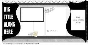
This was from a day trip in May for our Anniversary, we have been going by the sign for this place many, many times. Well my husband surprised me and on a whim we stopped to check it out. I used this sketch over at Let's Scrap sketches:

This is my go to blog for when I want to do double sketches, when I have lots of photos. This one was fun to do and it had that interactive part of the layout that I could add more photos.
I thought that from the Kraft Kuts collection that the scallop circle would be the better addition for those side pieces on the sketch. This side it held my title for the layout. Added some of those rubons that were in my kit and I also used up the travel stickers from the one pack I had in the kit.
The postcard that I purchased, I do like to get these for layouts it just seems to be a better picture and I love the angle of this one.
The right side of the layout holds 6 photos (2 are hidden) and the brochure. I attached with the intent that it can be opened.
Lots of information about the Flour Mill in the brochure.
When you open up the scallop circle on the right hand side you get these 2 extra pictures and some extra journaling.More journaling about the day. This layout was also created on the last day of the Summer Lovin LOADmini Day 7: Summer is a Time For Adventure: We haven't taken many road trips this summer, but we did get this day trip in. Really enjoying scrapping with this month's counterfeit kit Easy Livin' and I still have a week to play with it :)
Thank you for stopping by and do continue on with the blog hop and see what Salla has created she does so many different creative things :) and you can see what she did create at her blog.


Lovely double pager - so much recorded and loads to enjoy - thanks for the pointer to the sketch blog too.
ReplyDeleteAnother double spread! Great! And so many great details to explore and discover on the page. I particularly love the two interactive elements. I have some of that kraft shaped paper from way back in the day - I'll have to fish it out and get it used up! Thanks for the inspiration.
ReplyDeleteLove how you were able to include brochures, lots of photos, and still add creative detail. Lovely sketch too!
ReplyDeleteGreat job with the challenge and the sketch!
ReplyDeleteThat sketch couldn't have been more perfect! What a fun outing for your anniversary. I love having postcards from trips as you are right - the photo is often better than what I could get. Love that traveler quote - I copied that down for future reference :) The only thing missing is, what did you buy???
ReplyDeleteLove the double page spread! It's wonderful that you included the postcard and brochure in the layouts to preserve such precious memory!
ReplyDeleteI love how you manage to include a nice variety of photos on your layouts. Great interpretation of the sketch - that split circle really catches the eye.
ReplyDeleteVery well executed! Wish I could trawl around that antique centre.Great use of ephemera too.
ReplyDeleteWhat an effective way to get so much of the experience included on the pages. Well done.
ReplyDeleteWhat a great way to use shaped papers, (and I have so many of them). Super trick to get more photos into the layout. I imagine you could even accordion two or three under there. Thanks for the excellent ideas.
ReplyDeleteA great layout with such a lot to see :)
ReplyDeleteWow, fantastic Layout. the folded section is great. Thanks for joining us at Lets Scrap.
ReplyDeleteGreat layout!! Love how you played with this sketch.. thanks for playing with us at Let's Scrap Sketches!!
ReplyDeleteHugs,
Cathy
Let's Scrap Sketches
Great Layout! Nice that you were able to include a postcard into it, what a great memory you have created. I like that there is a lot of journaling and pamphlets added to really tell the story. Well done, thanks for playing with Let's Scrap Sketches.
ReplyDeleteGreat use of flaps and hidden journalling/photos...this sketch was perfect to get using the die cut sheets too!
ReplyDelete