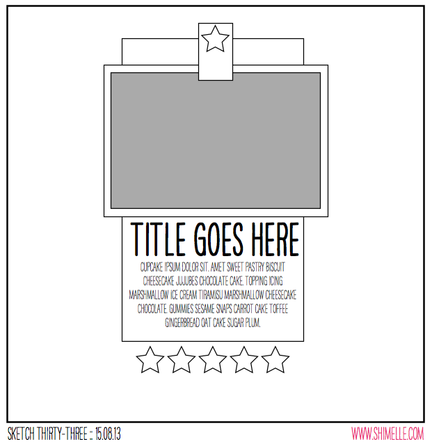
 Good Morning and welcome to September
Counterfeit Kit Challenge Blog Hop.I'm following the very inspiring Julie and if you are coming from her blog then your on the right track :) but if not you may want to start at The Counterfeit Kit Challenge Blog
and get on board with the first stop on this month's blog hop. This is
always a fun blog hop showing off the ladies creations from their
current counterfeit kit. This month, you can choose to share any project
you have
made with your Counterfeit Kit Challenge kit which you have
not shared on your blog yet. Your project could be related to
any of the three challenges or maybe just something you made
with your kit. As a reminder, here are the three challenges
this month:
 - Challenge #1: - Sketches! (Shimelle sketches)
- Challenge #2: - Just One Lesson
- Challenge #3: - Inspired by Kate Spade

This was such a cool sketch to use for this photo and for the card I made for Sketches in Thyme Project Life style. I used some of the Dazzles kit that was with in my kit of A Little Fall in the Air with some other papers from my stash in my kit. Glad to use up those chipboard pieces I got awhile back in a smashbook package of dodads :) A page that came together pretty quickly too just around a half an hour to create.
Thank you for stopping by and do continue on with the blog hop and see what Lisa has created she does so magnificent creations :) and you can see what she did create at her blog.

Great take on the Sketch. So lovely colours.
ReplyDeleteLooks good enough to eat! I like everything on your page plus the great sketch.
ReplyDeleteOh I like this. You've made it just so slightly asymmetrical and that adds more interest than if you had followed the sketch exactly. And of course you know I love that journal card!!
ReplyDeleteGreat take on this sketch Tina! The papers you used give the page a nice, homespun look that's just perfect for your topic.
ReplyDeleteSometimes those quick layouts are the best - great use of the sketch :)
ReplyDeletegreat use of the sketch and the diagonal line through it makes it flow so well. thanks for your sweet words and great that you were on the hop again this month :-)
ReplyDeleteOoo definitely good stuff! Loved your layout - great interpretation of the sketch and made it suited to your style!
ReplyDeleteWonderful layout--great job with the sketch!
ReplyDeleteGreat layout Tina, I might have try these counterfeit challenges.
ReplyDelete